In our first face chart lesson with Kat we learned the basics of face charting and various techniques that makeup artists often use when planning looks. For my face chart I decided to use cream products, as we were not working on watercolour paper therefore cream products were a better base, and blending is much easier on normal paper when using creams. I usually use cream products for my face charts, as I find that they give the face more prominent definition than powders, and the smooth texture is a lot better to work into. I also like my face charts to have an element of realism, and I feel that with cream products you can achieve more realistic looking skin, but I have also been experimenting with powders more recently.
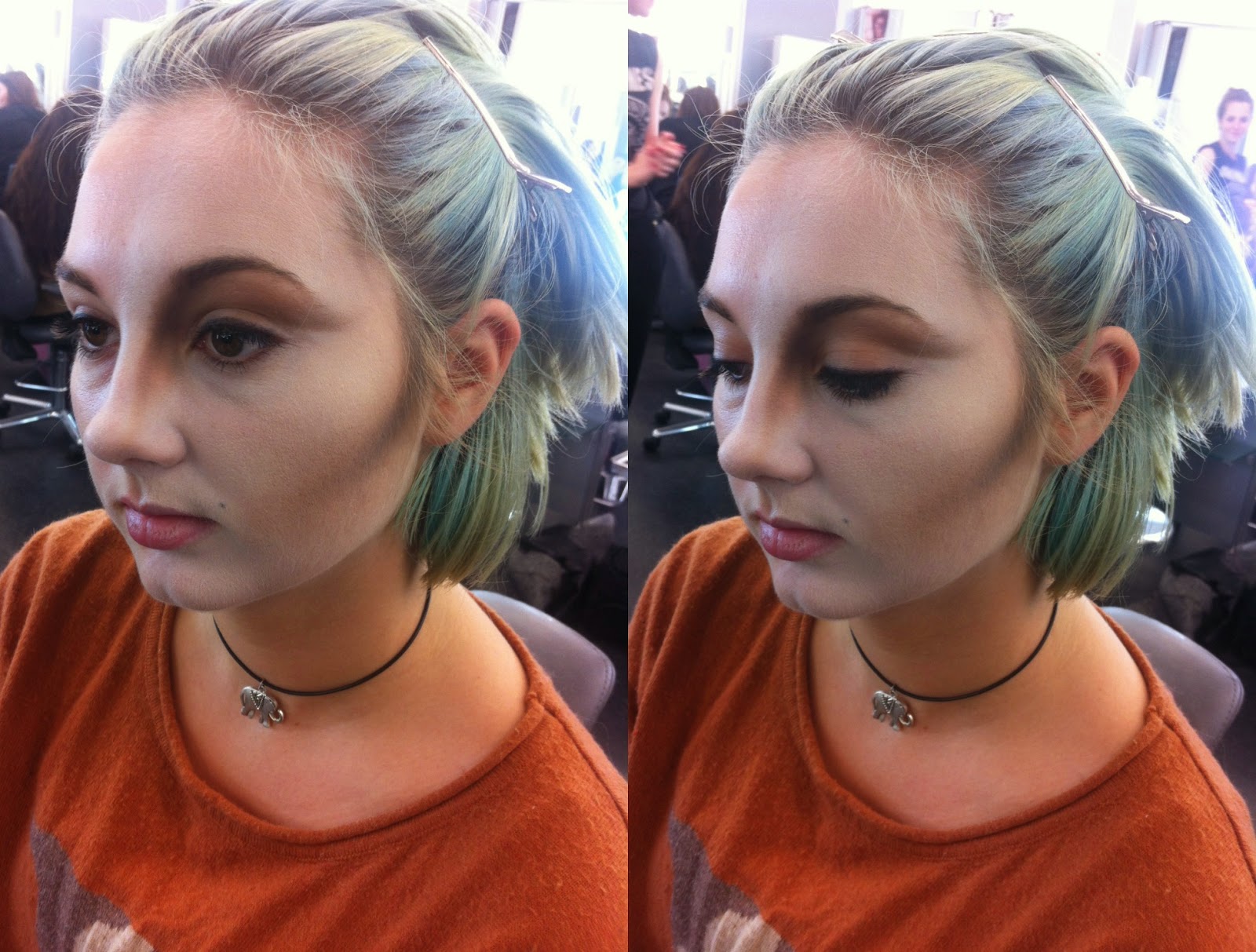
My look wasn't really pre-planned and I mostly made it up as I went along. I wanted to do something quite alien-esque, but with a gothic twist. I purposely left out the eyebrows, instead putting black eyeshadow (Kryolan Supracolour) all the way up to where the brow should be for a more avant-garde look.
For the lip I wanted quite a vampiric vibe, so I used a wine-red all over and then blended in black Lip Mix around the edges for a more dimensional effect. This gave the lip a purple tone, so I decided to use purple on the eyelid, and highlighted that with gold on the inner corner of the eye, just because I love the way purple and gold look together.
For the eyeliner and lashes I used the method I always use: Indian ink and a 000 paintbrush. I often use these materials for illustration, as I find they make it possible to achieve thin, precise linework with clean, sharp edges. For the eyeliner I opted for a more contemporary take on the classic "cat eye" making it into a double wing and also defining the crease.
Before this lesson I hadn't made any face charts in quite a long time, so this was really helpful and a great opportunity to just play around with different techniques and experiment with a totally unplanned look.
In Kat's lesson we began to learn avant-garde makeup techniques, starting with extreme contouring. Extreme contouring is an amplified version of everyday beauty contouring and is a technique often used in more experimental makeup looks, as it can be very diverse and used to create a wide variety of different effects. You can contour with any colour you like, and contouring different areas will change the appearance of the facial structure in different ways.
Essentially, contouring is using makeup to manipulate the natural structure of the face, shading areas to make them more defined and highlighting other areas to bring them out more. This is very useful in photography, as it means certain areas will catch the light and others will appear to have more of a shadow, therefore altering the face shape.
Kat's demo
In her demo Kat used a white base (Illamasqua Skin Base Foundation in Shade 01) as she was contouring with dark colours and a pale base would accentuate the contoured features even further. She focused on the cheekbone, nose and eye areas to create a more sculpted appearance to the models face. I think this look was really successful and work really well as an editorial piece.
My work
In her demo Kat used powder products to contour. I also decided to use powders, as I prefer working with powder prdoucts over creams - I find they blend better whilst retaining pigmentation. For the base I used Illamasqua Matte Primer, then a mixture of Illamasqua Skin Base in shade 01 and MAC Full Coverage Foundation in shade W10, and I set the base with Illamasqua Translucent Loose Powder. I would have like to have spent more time on the skin but our time was quite limited.
I began by contouring the cheek, following just under Amelia's natural cheekbone. I started with my lightest colour, Kryolan Glamour Glow in Glamour Tan, which I used to mark out the cheekbone. I also used the same product to mark out my contour on the nose and eye socket. I then worked into this with a slightly darker shade; Illamasqua Sculpting Powder in Heliopolis, blending out the Kryolan Glamour Glow as I worked. I used Heliopolis to work into the areas that I had already marked out with Glamour Tan, as I intended to work from the lightest colour to the darkest.
I then began to blend in the darker colours to make the contour more dramatic. I used Illamasqua Eyeshadow in Wolf in the inner corners of each contoured area, so the crease of the eye, from the inner browbone down the nose, and on the upper half of the cheekbone. Once I'd blended Wolf in, the contour was significantly darker, but I wanted to make it more extreme, so I decided to use Illamasqua Eyeshadow in Obsidian to give it a darker appearance and a more dramatic shadow. Because Obsidian is so dark and highly pigmented I only used a tiny amount, working into the areas where I had already used Wolf. I only used Obsidian on the upper third of the cheekbone, making sure I blended it into the hairline.
To highlight I used Illamasqua Sculpting Powder in Lumos along the cheekbone and down the length of the nose. To highlight the browbone I used Illamasqua Eyeshadow in Precipice. I also used a small amount of Precipice on the cheekbone, blending it with Lumos to create more of a highlight.
Out of all of our practical work so far I definitely enjoyed this task the most, as I love working with more avant garde and dramatic designs. I found this task relatively simple and I was happy with my blending, although I would have liked to have been able to spend more time on my piece. I will definitely be using the extreme contour in my future work as I think it's a very beautiful and eye-catching technique.
Recently we went on a course trip to London to visit the National Portrait Gallery and also to visit some of the makeup shops in the West End. This was such a fun trip and I had a really lovely time!
When we arrived in London we went straight to the National Portrait Gallery to visit The Real Tudors exhibition. Although I had already chosen my Elizabethan portrait it was still really great to see some of the original portraiture from the era. The work was absolutely mesmerizing and the artists of that time were highly skilled. I couldn't believe how hyper-realistic some of the work was, and it was amazing to be able to get so close to it, as you could barely even see the brush strokes. It was also interesting to see a collection of portraits of Henry VIII as none of them looked like the same person, and it still makes us wonder what he actually looked like, and which portrait was the most accurate.
After we finished looking around the National Portrait Gallery we headed into Covent Garden to go to the MAC Pro store where we received a 35% discount. There were so many useful products in the store and it was difficult to choose just a few! In the end I bought MAC's Full Coverage Foundation in shades W10 and NW45 for my kit, as we don't have an extremely light or dark foundation in our kit and I thought buying the lightest shade and one of the darkest would be practical for mixing.
We also went to the Illamasqua store on Beak Street where we received a 25% discount. I decided to get Skin Base Foundation in the darkest shade, as it was a lot darker than MAC's NW45 and I can now mix any base colour with the products in my kit. I purposely picked foundations that I thought would be good for using when working with cameras and that would mix well with the Kryolan foundation palette we already have.
The London trip was a really productive day, and it was lovely to be back in my city. I really enjoyed the trip and look forward to the next one!
The main inspiration for Alexander McQueen's AW13 collection (designed by Sarah Burton) was drawn from piety and Catholicism. The ten outfits were divided into subgroups: communion, nuns, popes, cardinals and angels. Although the collection primarily held religious connotations, the influence of Elizabethan fashion is evident within each outfit, and the outfits of the "cardinals" appear to be a nod to the Virgin Queen herself. The way the models walked through the venue actually seemed like some sort of procession within a church, and the venue perfectly coincided with the theme of the collection.
Communion looks 1 & 2 (photos from style.com)
The first looks to come down the runway were Communion. Dressed in virgin white, the models looked ethereal.The use of white lace, puffed sleeves and layering of skirts made these outfits seem reminiscent of elaborate baptismal costume, and I found the boxy cuts of the dresses to be almost like the cut of children's clothing. These looks definitely had an air of purity about them.
Close ups of looks 1 & 2 (photos from vogue.co.uk)
I absolutely loved the intricacy of the white lace, and I also thought the white finger caps with bells on were a beautiful touch. The shoes which accompanied the Communion looks really echoed Elizabethan regality, with gorgeous pearl detailing, and I also liked the more contemporary touch of a metal capped toe.
Nuns looks 3 & 4 (Photos from style.com)
The second subgroup were the Nuns, wearing outfits compromised of black leather and studs. The silhouette of their outfits really resembled some sort of punk rock habit, especially in Look 4 with the prominent white cut off at the shoulders, contrasting against the black leather.
Close ups of looks 3 & 4 (photos from vogue.co.uk)
I thought these looks were a really interesting take on the traditional costume of nuns, and I love that Sarah Burton has opted for a more punk vibe, especially with the knee-high black leather studded boots and pearl-encrusted knuckle-dusters.
Popes looks 5 & 6 (photos from style.com)
Then the Popes came down the runway and they were also wearing black. I absolutely loved these outfits and I felt they really had an air of gothic romanticism about them. The historic influence was so clear in these ensembles, and I thought the pattern on the bodices looked similar to the architecture of old churches and the structure of stained-glass windows.
Close ups of looks 5 & 6 (photos from vogue.co.uk)
I also think the combination of alternative streetstyle with historic fashion is a key theme in the Popes outfits, for example the pearl fishnet tights. These were probably one of my favourite accessories of the whole collection as I thought they complimented the outfits beautifully and were just such a unique concept.
Cardinals looks 7 & 8 (photos from style.com)
Of all the looks in the collection the Cardinals are definitely my favourite. It's clear that these looks were heavily inspired by the style of Queen Elizabeth. Although Queen Elizabeth was a Protestant and her reign returned England to Protestantism, she treated both Catholics and Protestants equally, unlike her sister Mary who reigned before her and executed hundreds of Protestants in her attempt to create a Catholic England. It's interesting that the McQueen collection has these contrasting religious and historical themes, but I think it works really well with the story behind the collection. The Cardinals outfits are absolutely stunning and I feel they really capture the essence of Elizabethan fashion. Although ruffs have been used in every outfit of this collection, I feel that they compliment looks 7 & 8 best. The colour scheme of these ensembles are beautiful and exude decadence, and I love the intricate embroidery.
Angels looks 9 & 10 (photos from style.com)
The last looks on the runway were the Angels. Saved for the finale, this contemporary take on the classic Christian angels were stunning. Substituting ostrich feather sleeves for wings, the religious reference was evident and the final looks tied together the whole show perfectly.
Throughout this collection there were many Elizabethan motifs; pearls, ruffs, intricate embroidery and all of these aspects worked very well with the religious theme of the collection. I really loved the use of the head cages in all of the looks, each one coordinating with it's individual outfit. I think these cages were quite reminiscent of Elizabethan headpieces and brought a really opulent feel to the collection in it's entirety.
photos from vogue.co.uk
The Alexander McQueen AW13 show can be seen in full here:
"It's like my mind is a tap of creativity and I can't turn it off... drip, drip, drip." - Alex Box
Last week I went back home to London, and had the amazing opportunity to see Alex Box's live performance at the Everyman Cinema in Selfridges. Watching Alex work is always such an intense experience, and I am always so moved by her work. The sheer emotion that she puts into her art seems to radiate throughout the entire room - her passion and dedication to her work is an overwhelming presence in itself.
The leaflet for the event along with some Illamasqua freebies - the Bronzing Powder Duo is now part of my uni kit!
As soon as Alex began to create her piece the room fell completely silent, the audience was utterly captivated. She begun with a beautiful contour which extended from the face on to the upper chest, defining the models collarbone and creating an almost skeletal appearance. Unfortunately I forgot to bring my camera to the performance so the pictures on this post will mostly be my rubbish quality iPhone photos :(
Picture from @zoelondondj on Twitter
After the contouring was finished the piece looked quite futuristic and alien-esque. The model was then styled with a headpiece and the stage was decorated with large white balloons. Alex began to create an on-screen light display which was projected on to the model. This reflected beautiful, wild strokes of colour on to the piece. The act in itself exuded creative liberation through free, expressive movement of light and colour.
Photo taken from Alex Box's official Facebook page
I thought that the way the light moved across the screen was absolutely beautiful. So far the look had been based mainly around pale shades, and this explosion of colour completely illuminated the piece.
Once this stage of the performance was finished Alex began to create a second headpiece, using what looked like a pre-made plastic/resin headpiece as a base, which she then pressed white, grey and black play-doh on to. This gave a really beautiful textured effect which was reminiscent of reptilian scales. The monochromatic colour scheme was continued throughout the rest of the piece, as Alex then added black and white makeup using very free, experimental brush strokes.
After the base for the headpiece was applied
Application of the play-doh and graphic makeup
Progression of the styling
Once the play-doh headpiece was finished, Alex then used black and white spray paint all over the model. I thought this really gave the look a feeling of raw expression, and I love the way that so many different materials were combined to bring this piece together.
Photo from @zoelondondj on Twitter
After the performance was finished Alex took questions from the audience. When asked about the concept for this piece, she described it as a surrender to emotion translated through makeup and art. This piece was so expressive and I love the idea of using makeup as an emotionally liberating art form. One of the key things about this piece was for Alex to take a risk in front of a live audience, essentially to let go of any inhibitions and completely surrender herself to creative flow. Personally I think the final look was extremely successful, and the emotional aspect just gave it even more meaning and made each stage more poignant. The look was constantly changing and evolving and each stage significantly altered the appearance of the model.
Myself and Alex after the performance - it's always so lovely talking to her!
This performance was very inspirational and I'm so glad I was able to see it - it was exactly what I needed. After watching Alex at work I definitely want to experiment more with expressive makeup, and I love the idea of emotionally surrendering and channeling it through makeup, as I imagine it is an extremely liberating experience.
Manila Luzon is a famous American drag queen, best known for appearing on the TV show RuPaul's Drag Race. Recently she released a single titled Eternal Queen, dedicated to her late boyfriend Antoine Ashley (Drag persona: Sahara Davenport) who passed away on October 1st 2012. Sahara was a highly prominent figure in the American drag community and had an extensive career in music, dance, and reality television. Manila's tribute to Sahara is extremely moving and there is some beautiful Elizabethan-inspired imagery in the video, which can be watched in full here:
One of Manila's main looks for this video was heavily inspired by Queen Elizabeth, and it really captures the essence of a strong, independent Queen. Manila's signature look is usually outfits compromised solely of black and white, so it's interesting to see her in a monochromatic costume. I think by wearing all white it is a subtle nod to Elizabeth's reputation as "the virgin Queen" as white usually represents purity and virginity, but I also think that due to the nature of the video this costume in particular holds connotations of fragility and emotional exposure.
Still from Manila Luzon - Eternal Queen (2014)
Still from Manila Luzon - Eternal Queen (2014)
The costume for this video is by New York designer Viktor Luna and I think it is a gorgeous modern interpretation whilst remaining true to the Elizabethan era. I particularly love the use of pearls as they really compliment the makeup, but pearls were also highly favoured by wealthy Elizabethan women. The dress is absolutely exquisite and retains so much authenticity and I love that an embellished ruff has been included - it completes the look and exudes regality. The whole look is very opulent and is perfect for the mood of the video.
Still from Manila Luzon - Eternal Queen (2014)
Still from Manila Luzon - Eternal Queen (2014)
Still from Manila Luzon - Eternal Queen (2014)
I think the makeup in this video is incredibly striking. I love the way the pearls have been used around the eyes and I would love to do something including pearls for my final look. I think the white eyelashes are gorgeous and fit in well with the monochromatic theme of the piece, and they really create a bold statement as opposed to a typical black eyelash. The pale skin also retains Elizabethan authenticity, and the whole look is perfectly completed with a contrasting red lip. I feel as though so much research and planning has gone into this look, and it really pays off because the ensemble as a whole is incredible.
Still from Manila Luzon - Eternal Queen (2014)
The wig for this look is by Wilma Whalley and is clearly inspired by classic Elizabethan hairstyles. Because of Queen Elizabeth's high hairline many Elizabethan women shaved their foreheads in order to achieve the appearance of a larger forehead, and it was fashionable for women to shave into their hairline to actually create a higher hairline. The wig Manila wears in Eternal Queen has cornrows at the front in order to mimic this Elizabethan trend. I love this modern twist and the wigmaker has clearly worked so hard to achieve an authentic Elizabethan look whilst incorporating contemporary style into her work.
I have chosen this photo to be my contemporary Elizabethan image, as I feel it has clear links to the Elizabethan era balanced with exactly the right amount of modern style. Although it is based on historical fashion, I think to some extent the look is highly futuristic, and I am often inspired by the alien-esque. I also love the idea of a Drag Queen Elizabeth, as Queen Elizabeth herself constantly challenged gender roles and ideas regarding femininity. I absolutely love the hair and makeup and I think they work so beautifully with the costume. As soon as I saw this look I was so inspired and I knew I had to include it as part of my project.
After finding my Elizabethan portrait for this project, I began to look for an image that conveys Elizabethan style but in a more contemporary way. Over the past few years Elizabethan style has been recurring within the fashion world, constantly being adapted to fit a more modern audience.
Initially I immediately thought of Vivienne Westwood, because to me she is the modern equivalent of Queen Elizabeth. Her look is modeled on Elizabeth, she has combined punk with history to create an entirely unique style. Throughout her career she has often been inspired by the Elizabethans, and clear references to the era can be seen in most of her catwalk shows.
Vivienne Westwood shot by Tim Walker
Queen Elizabeth's iconic look has also been referenced in recent films, for example Tim Burton's 2010 Alice in Wonderland, where the character of The Queen of Hearts (played by Helena Bonham Carter) had a very Elizabethan-inspired wardrobe.
Still from Alice in Wonderland (2010)
The pale face and bright red hair exudes the classic Elizabethan beauty ideals, and the high, white collar on the dress is almost reminiscent of a ruff. The eye makeup gives more of a 1920's vibe, with the thin semi-circular eyebrows, however the red lipstick can also be considered to be a reflection of Elizabethan beauty trends. In this particular costume the heart shape is a recurring motif, predominantly because the character is the Queen of Hearts, however the heart shape was also very popular within Elizabethan hair and fashion.
Helena Bonham Carter shot by Tim Walker
Above is another image of Helena Bonham Carter in Elizabethan-inspired costume, shot by fashion photographer Tim Walker. This definitely has more of a contemporary twist, such as the inclusion of the Coke can and the sunglasses, but the Elizabethan essence is still highly prominent and can be seen with the inclusion of the pearls, the crown and the orb. The makeup in this image is also very Elizabethan: a pale complexion with a red lip and red cheeks. I love Tim Walkers work - it tends to be very whimsical and romantic and he often finds inspiration from iconic periods within history and projects this onto his models.
Recently in the celebrity world, particularly among female musicians, Queen Elizabeth has been a source of style inspiration, with many artists taking her look and customizing it to make it their own.
Lady Gaga at the Royal Variety Performance (2009)
Promotional image for Beyonce's Mrs Carter World Tour (2014)
Paloma Faith wearing Inbar Spector (2012)
In all three of these images the reference to Elizabethan fashion and culture is very clear: Lady Gaga's red latex ruff and gown, Beyonce's heavily embellished bodysuit with gold cage and high collar, and Paloma Faith's large golden embroidered dress and red hair.
Cara DeLevingne for i-D The Priceless Issue Winter 2013
I find it very interesting to see period styles constantly being recycled and reinvented and used over and over again in theatre, film and fashion. I think it's amazing how designers and directors alike can always use the old to create something new and fresh, but with an air of authenticity, and I aim to do this within my work.
This portrait is of the Italian aristocrat, Marchesa Maria Serra Pallavicino and was painted by Peter Paul Rubens on a trip to in Genoa in 1606. Little is known about the sitter, and originally she had been mis-identified as Marchesa Isabella Grimaldi. However, we do know that she was the wife of nobleman Niccolo Pallavicini, who was partially responsible for controlling the banking, economy and politics of Genoa, a responsibility the Pallavicini family shared with other Genoese aristocratic families such as the Spinolas, the Grimaldis, and the Durazzos.
I was struck by the sheer opulence of this portrait, as well as the hyper-realistic way in which Rubens has painted the piece. The sitters costume exudes wealth and nobility, and her social status is embodied by the shimmering gold silk fabric of her gown, which is decorated with goldwork embroidery, further conveying the extent of her wealth. Interestingly, the lower skirt is not supported by an internal frame or cage, meaning that the fabric hung loosely, but I think this would really compliment the way the over sized sleeves would hang. Her ruff is extremely large and heavily embellished, framing her face beautifully and completing the dress. I love the way in which her costume just seems to flow, each piece compliments the next piece so well. The sitters hair is accessorized with flowers, jewels, and a white heron feather, which is symbolic of peace and purity. I love the way her hair is styled and how the adornments are composed, and I will definitely be referring back to this in my later work.
The composition of the portrait is also very interesting: she is seated on a plush throne-like chair, and her stance itself seems quite regal. A parrot is perched on the left side of the chair: in the Elizabethan era parrots were a symbol of status among the European aristocracy, as they held connotations of rarity and exoticism. The setting of the portrait is very grand, and personally I feel that it truly reflects the essence of the subject.
I have chosen this portrait as my Elizabethan image because of all the portraits I looked at this one really inspired me on a level that none of the others did. I love how lavish the painting is, and the way Peter Paul Rubens paints is extraordinary. To me, his work really stands out from the other artists of the Elizabethan era - his style is so different and personally I feel that it is far more memorable. I think the subject is the epitome of Elizabethan beauty, and there is some really interesting symbolism within this portrait.
Over the weekend I attended the Illamasqua Distinction in Makeup Artistry Awards, held at BAFTA in Piccadilly, London. I attended the awards last year and it was such a good experience, and this year was even better. The artists competing at Illamasqua DIMUA's are always so talented and their work is highly conceptual. I love seeing the different interpretations of the given theme - this years theme was Art vs Textiles and the range of looks was so diverse.
I arrived at the event for the Pro Category, and of all the categories I think the work produced by the pro artists was the most impressive. Each contestant had taken such a different approach to their look - Branka Vorkapic's work was very runway and looked as though it could have been part of a John Galliano show, whilst Julie Rombaudt's look was clearly very Elizabethan inspired.
All of the completed Pro looks (image from Illamasqua's official Facebook page)
From left to right: Jemma Grace, Julie Rombaudt, Branka Vorkapic, Michelle Anderson
Of the four contestants my favourite look was by Michelle Anderson. Her piece was so expressive and had clear correlation to the given theme. I loved her use of bold colours and unique brush strokes. Of all the contestants I feel that Michelle's work was the one piece that was constantly changing and evolving, watching her work was almost like watching a performance piece. I learned so many new techniques just by watching her, the way she used her tools was highly innovative.
Gorgeous brushstrokes on Michelle Andersons look
Michelle Anderson's finished piece
My favourite thing about the live performances at the DIMUA's is seeing each look unfold and develop into the final piece. It never fails to amaze me how the artists create something so extraordinary from a blank canvas, and it's clear how much time, work and dedication they have put into creating their final look.
First stages of Julie Rombaudt's look
Development of Julie Rombaudt's look
Application of the final touches
Julie Rombaudt's look was clearly Elizabethan-inspired, and she executed it very well, creating an elegant Queen Elizabeth with a contemporary twist. I thought the black latex applique was a gorgeous touch and really exaggerated the regality of the look as a whole. I also thought her chosen colour palette really complimented the Elizabethan theme.
The finished look
I also really loved that Branka Vorkapic took a high-fashion approach to the competition and created a very avant-garde editorial look. I thought her use of gold leaf was very effective and her colour palette was beautiful, the colours complimented each other so well. Her spiral headpieces were so original and worked perfectly with the makeup, and the styling really just pulled the look together as a whole, resulting in a highly polished piece of work.
The second category I saw was the Illamasqua artists, who also created some truly stunning pieces of work. I felt like this particular category took a more cultural approach to the theme, with clear references to different traditions and cultures around the world.
All of the completed Illamasqua looks (image from Illamasqua's official Facebook page)
From left to right: Minx Hafon, Panda Chantatot, Frankie McKernon, Charlie Butterfield
All of the looks in this category were extremely striking, but my favourite by far was Frankie McKernon's. The makeup design itself was beautiful, and the look she created was so soft - it was a true beauty look which can be incredibly hard to achieve.
Frankie's look before the hair was added
Her idea of adding the hair to the model's face was very innovative, and I felt it really gave her the edge within her category. She showed her skill by creating a flawless, soft, beauty look, but then also showed her creativity and innovative concepts by completing the look with hair accents. I just think everything about this piece was so perfect, and she was meticulous in regard to placement. The final look gave off a windswept, feral vibe and I feel as far as character creation goes this look was definitely the strongest, as the makeup and hair accents just look so right on the model, as though they're part of her and should always be there.
The final look
Another artist in this category who really impressed me was Panda Chantatot. His precision and skill was astounding and his linework was flawless. He created the most perfect lines which really reflected his artistic talent. His look was Thai-inspired and he went to great lengths to ensure that it was authentic, dressing his model in a traditional Thai headpiece and costume.
Panda at work
Panda's completed look
I would definitely like to experiment with some of Panda's techniques, I think he is a highly skilled artist and I found his work extremely inspiring. It was a beautiful homage to his country.
The Illamasqua DIMUA Awards was a really fun day and it gave me so much inspiration. It was great to see some unique looks being created and I feel as though just by watching these artists I learned so many new techniques, which I will definitely be putting into practice throughout the New Elizabethans project.

.JPG)

.JPG)

.JPG)
.JPG)
.JPG)
.JPG)


.JPG)
.JPG)
.JPG)

.JPG)
.JPG)

.JPG)
.JPG)


